Anyway. Looking through gallery upon gallery, I'm noticing that despite the street style depicting decades past, it's always a more exaggerated version that that of the actual decade. Bigger bows, dramatic lines, that kind of thing.
On the runway this isn't as common for the most recent collections. Of course, it's still there--fashion is a cycle, after all--but now I'm seeing designers concentrate more on the structure of the clothes than on decades to pay homage to. Now, I love theatrical outfits (come on, I dress ''like a gay actor'' half the time, I think it's kind of a given that dramatic outfits = my love). But the change of focus is a welcome change every once in awhile.
Example:
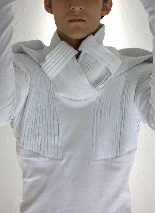
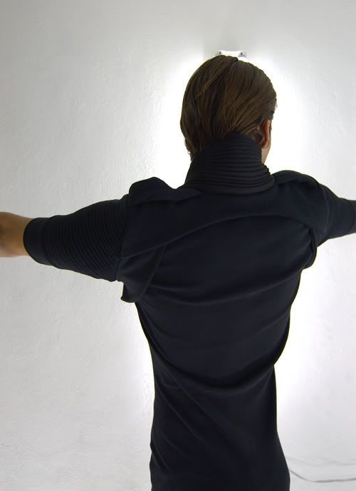
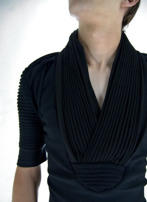
ARCHITECTURAL CLOTHES Mechanical Connection Vol. II S/S '08
I love this collection. At first glance, I thought it was bland...nothing screamed out, caught my eye--it was just too simple. And then, you look deeper. The material. The way it moves with your body. The....gimmick, I guess would be a good word to describe it. It's not so much clothing as art, and subtle art at that. It's.....architecture, and that's exactly what the designer wanted. The designer is not so much someone who makes clothes, but clothes that remind you of architecture. And I love it. Going through the line piece by piece, you can see a story. I think it'd look great in a magazine spread and quite frankly, on my best friends.
Ooooooohhhh, I feel so good right now. So satisfied! I just found these amazing, fantastical sketches.... designer or wannabe? Leave your guesses in the comments. :)


